Clara DeGalan
Clara DeGalan is a well known artist, curator, and instructor in the Detroit metro area. On a break from teaching she needed a new sleek and modern portfolio website.
Refine Brand Style
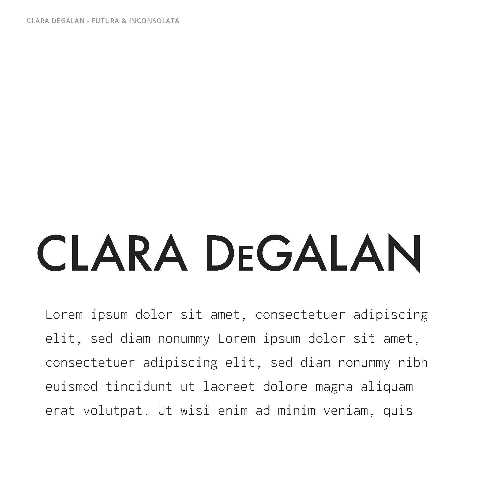
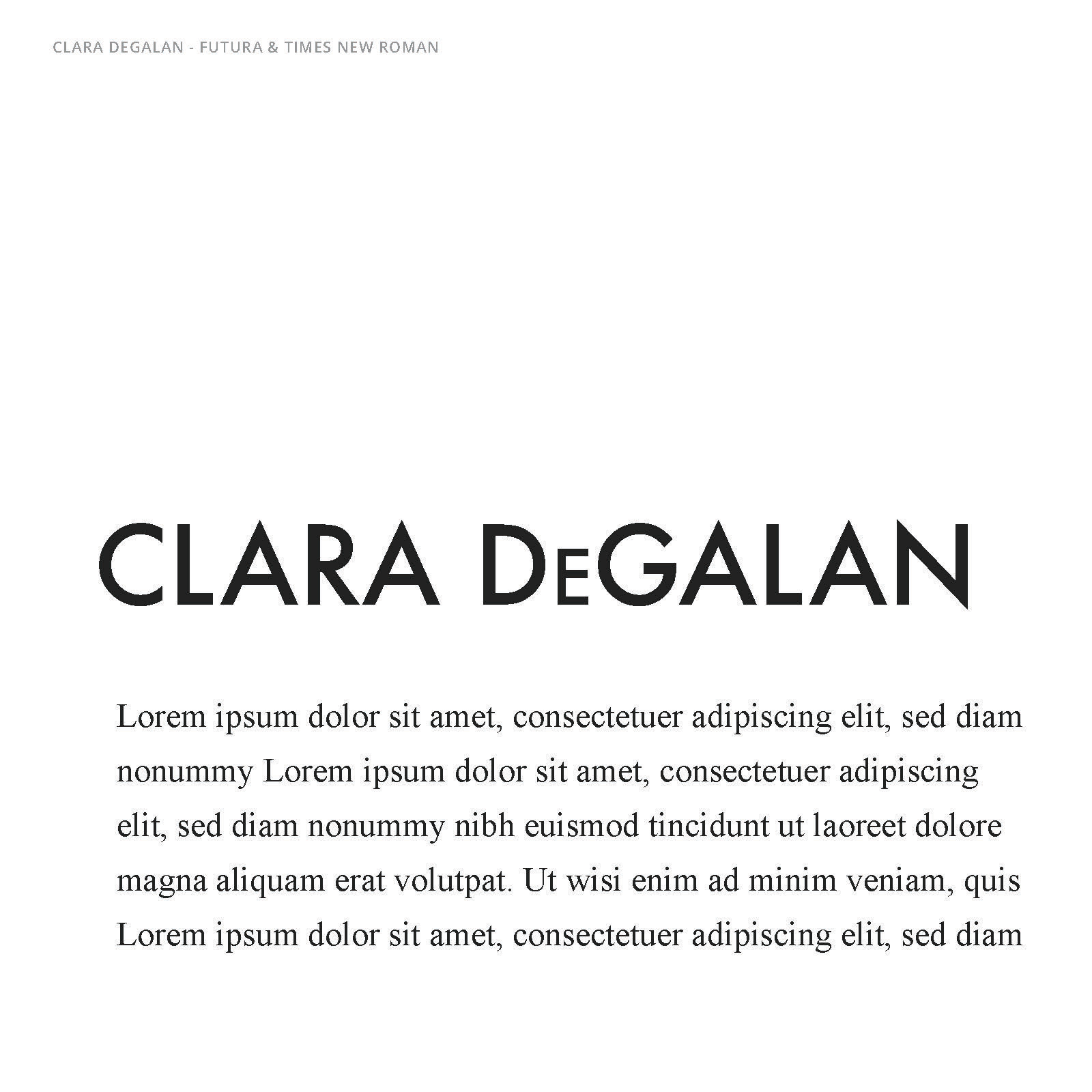
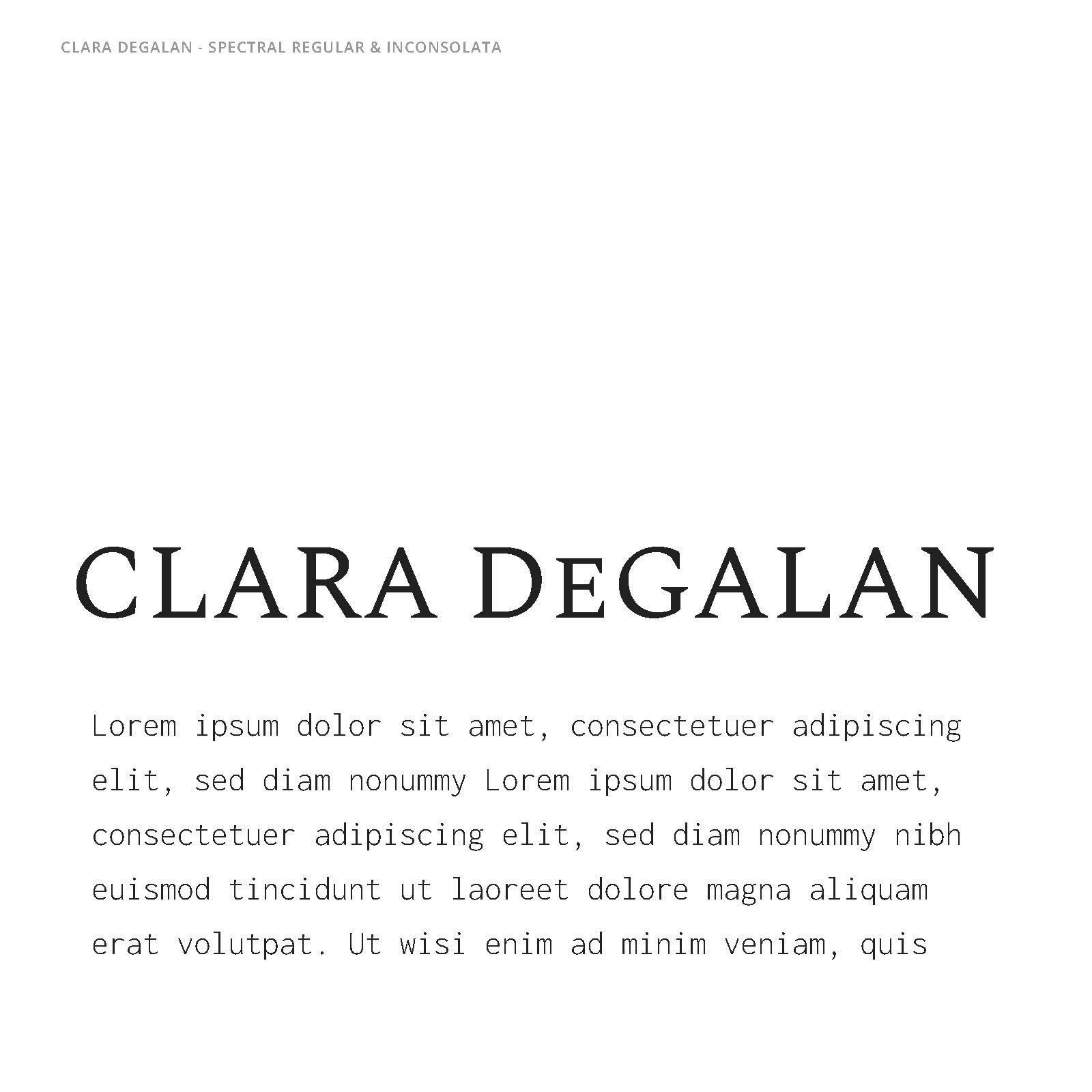
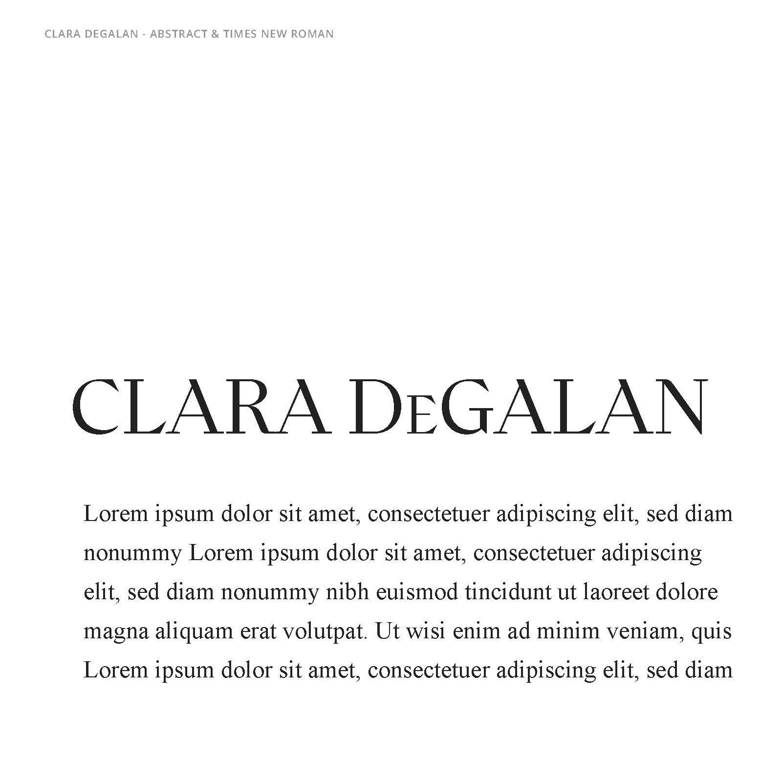
A few typographic combinations were explored in alignment with Clara DeGalan's artistic preferences and chosen aesthetic. After exploring the pastel palette intended, we settled on a classic black, white, and gray to keep the feel sleek and professional.


Sleek Design, Simple Functionality
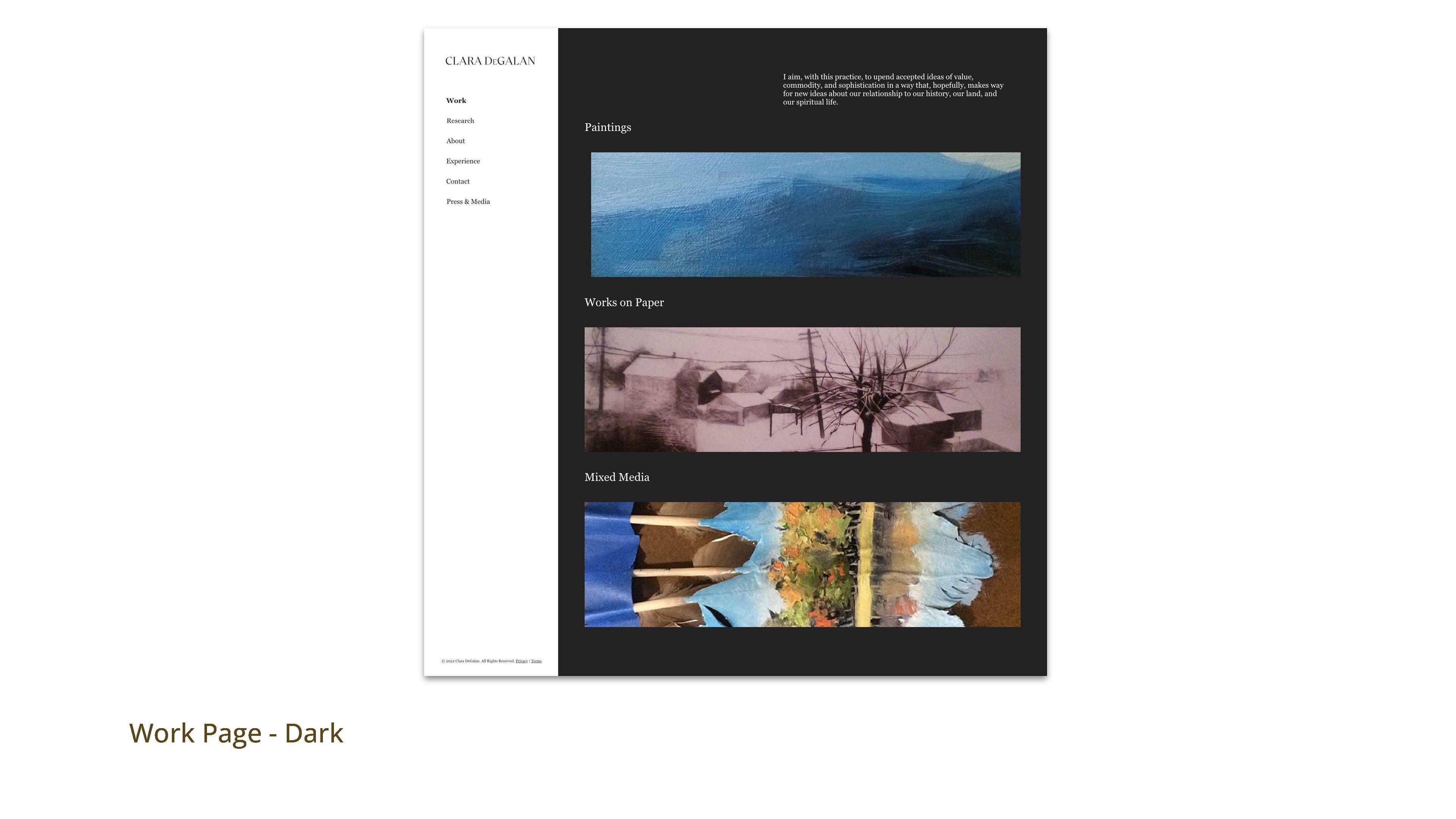
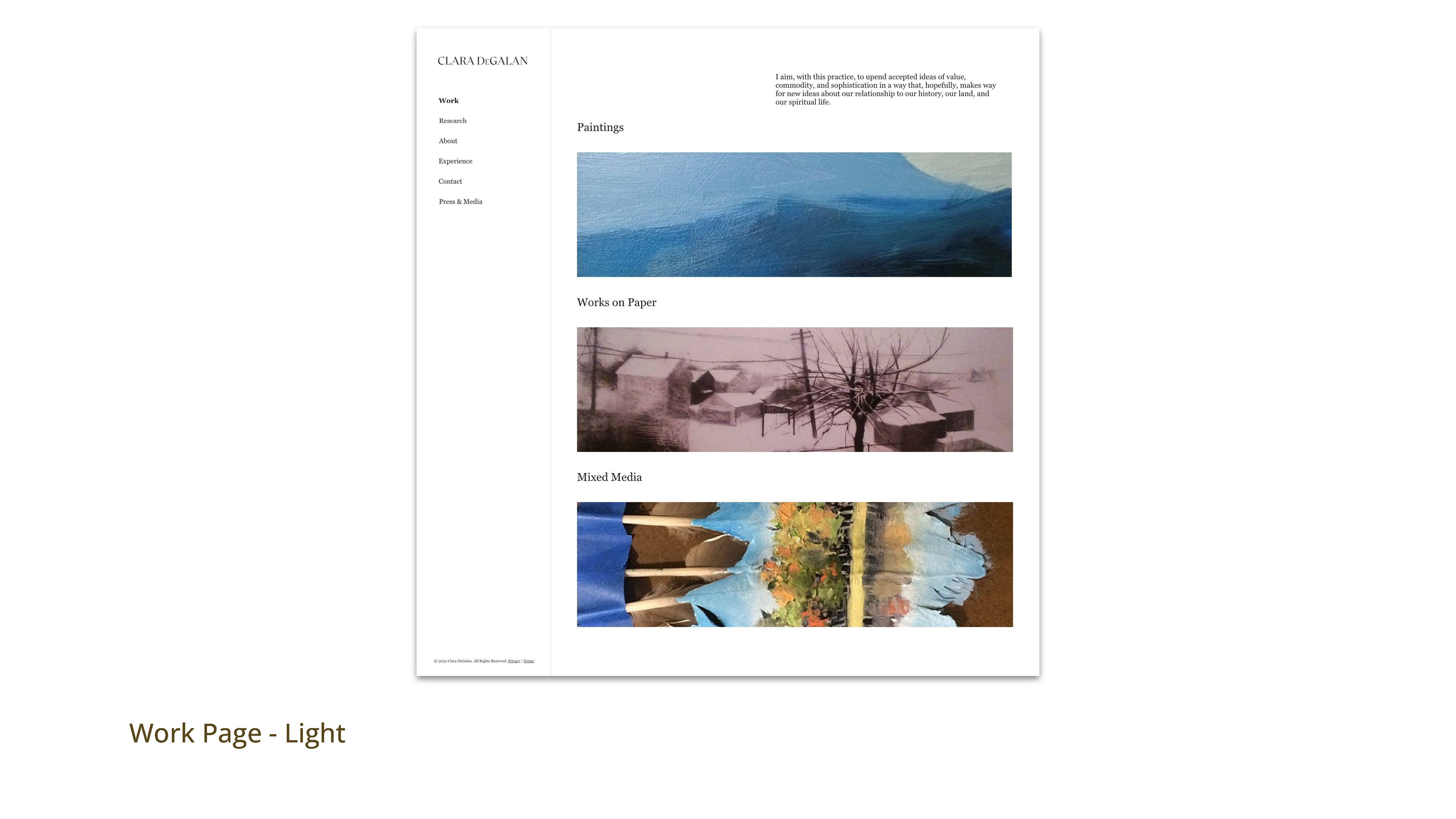
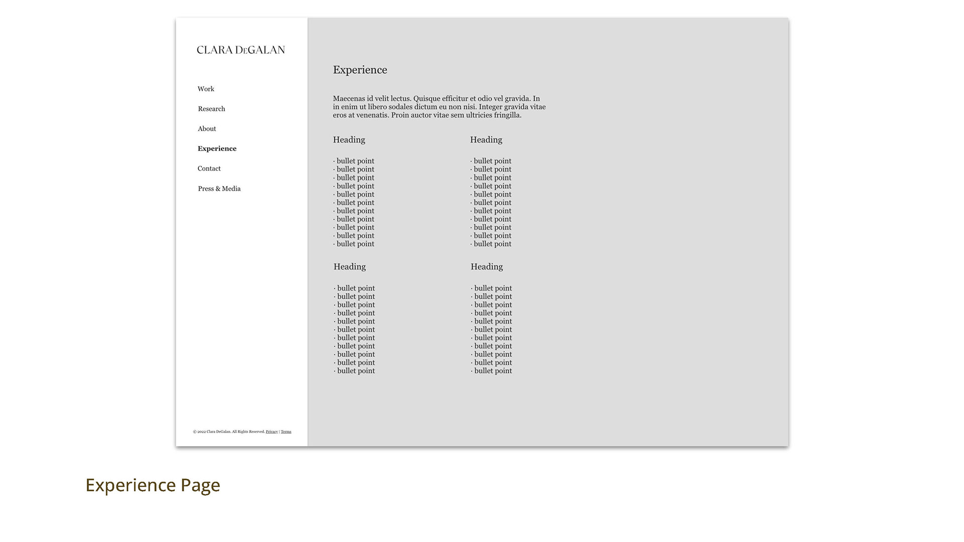
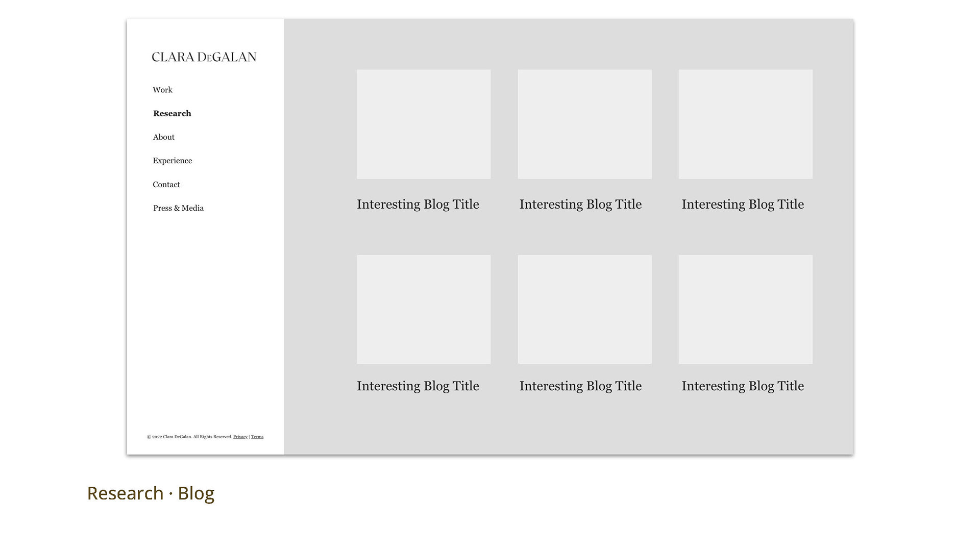
A sitemap and content strategy for Clara DeGalan required consideration of an archive of paintings and yet to be displayed work within defined project mediums: paintings, works on paper, and mixed media. We also integrated a "RESEARCH" blog for artistic insights to be shared with Clara's audience via Mailchimp each month.
High Fidelity Decisions
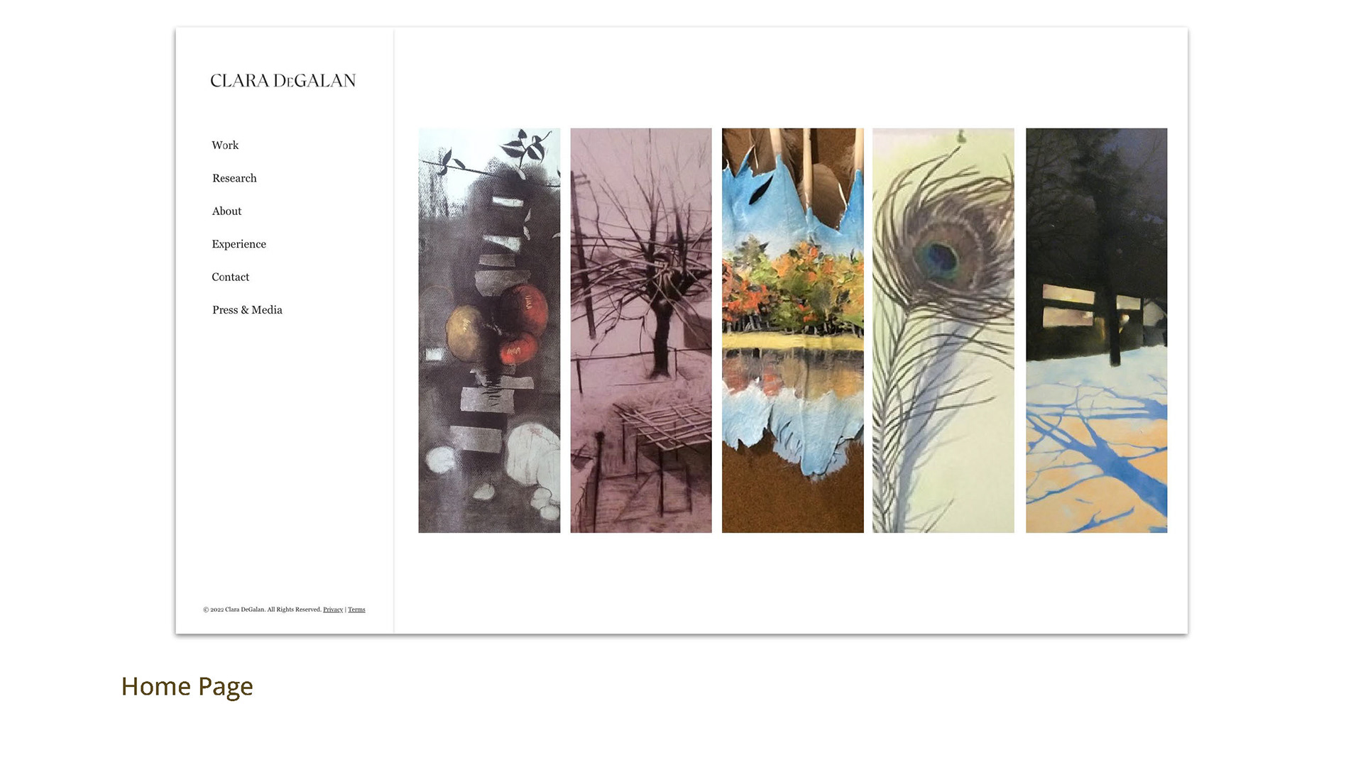
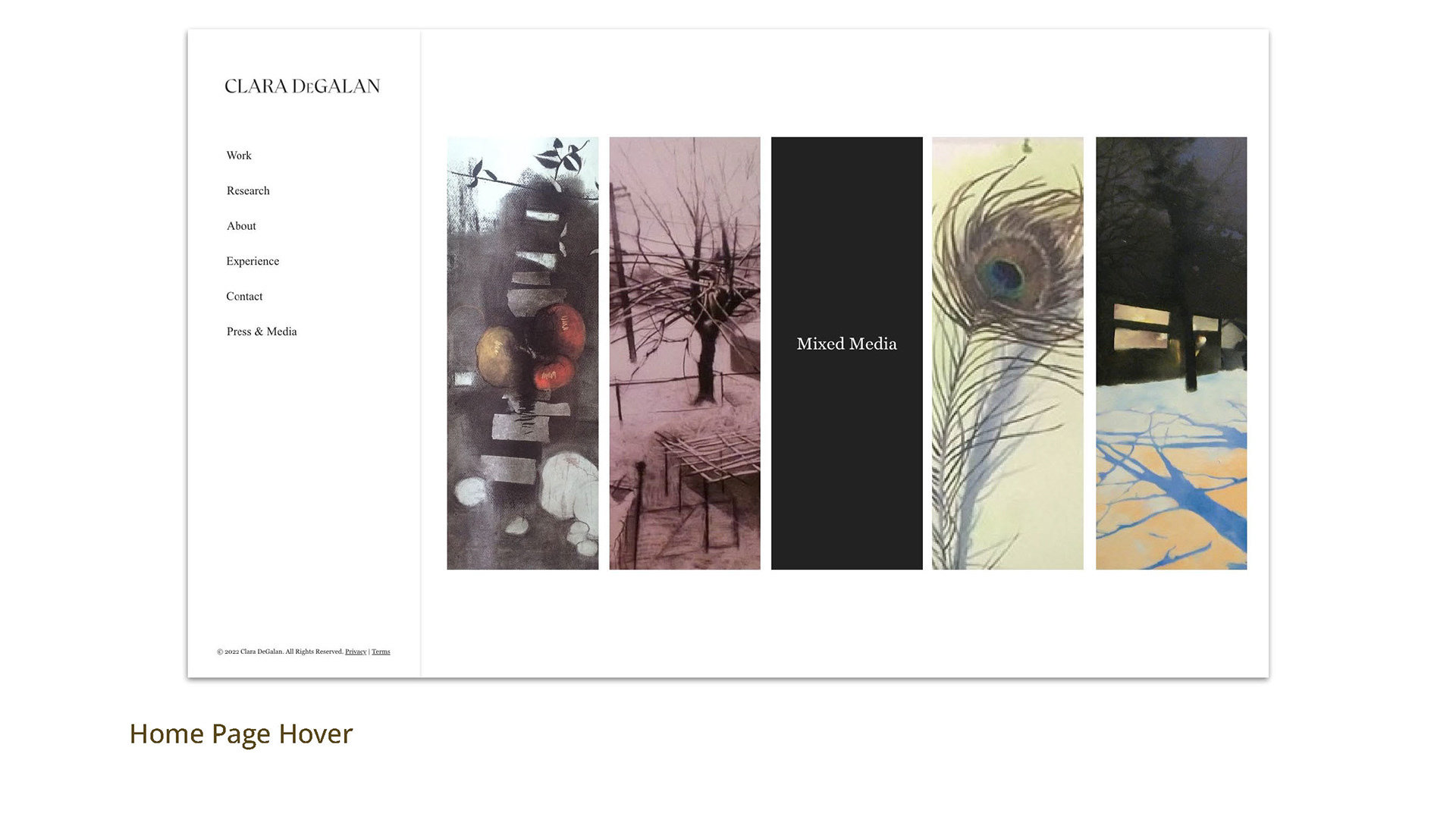
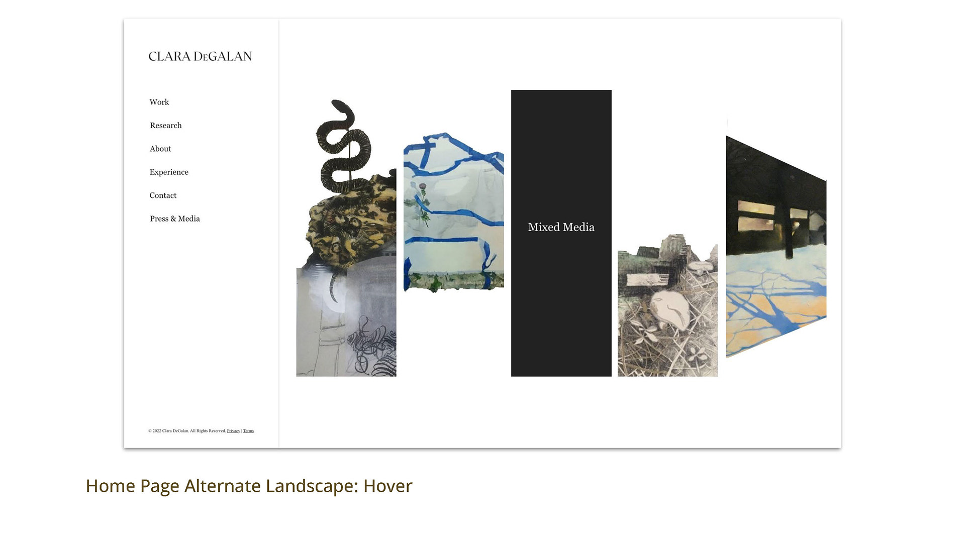
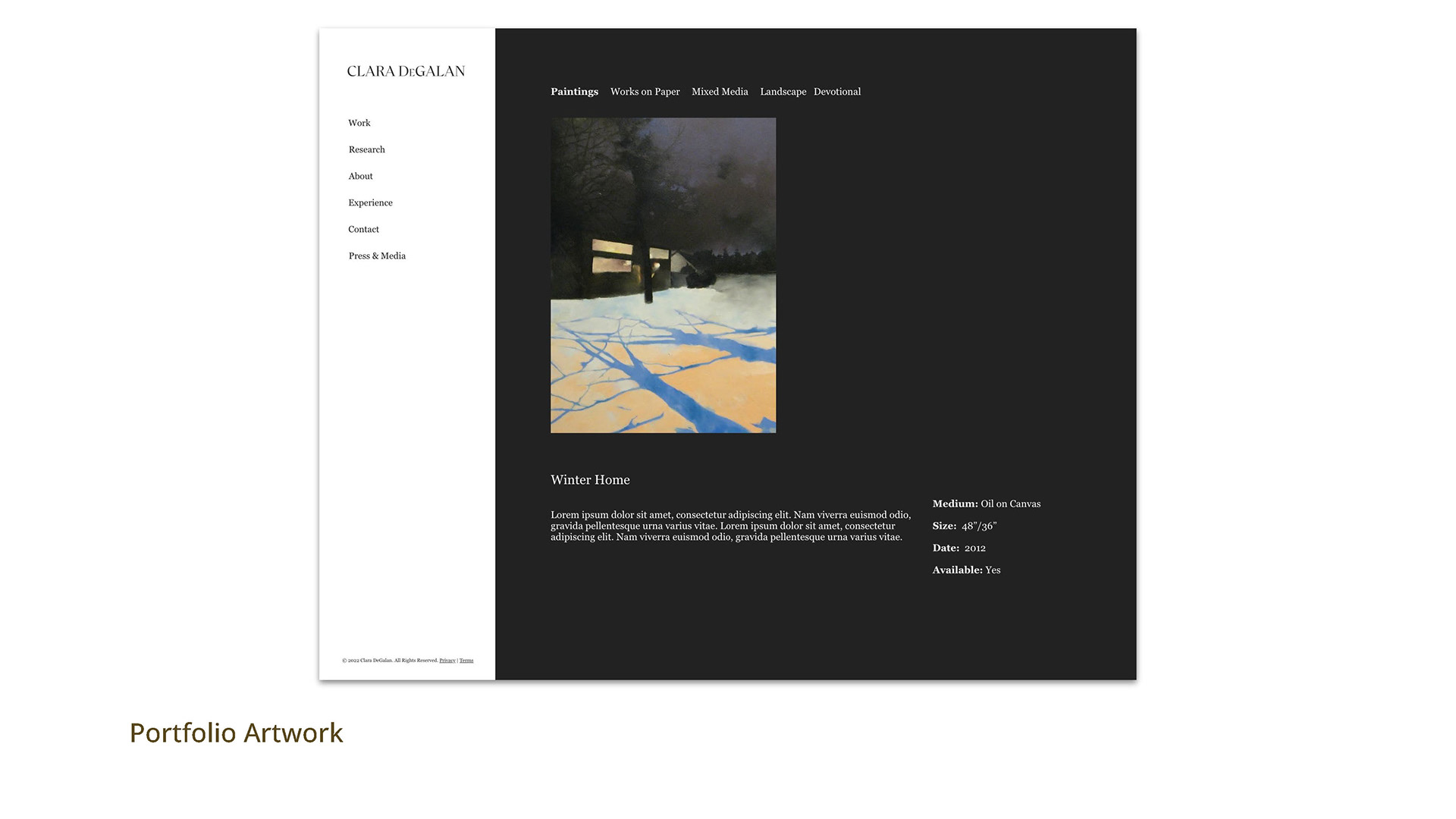
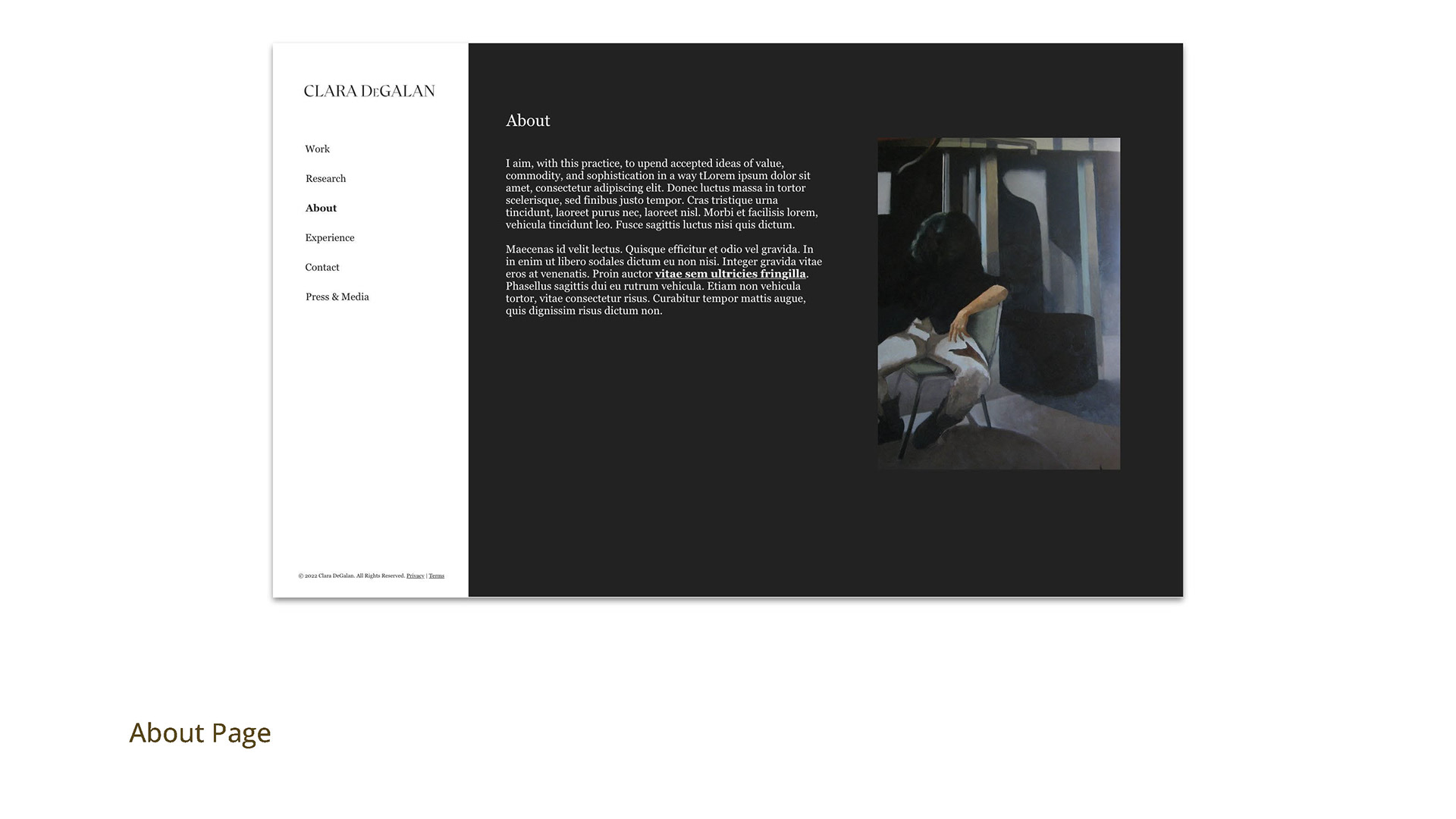
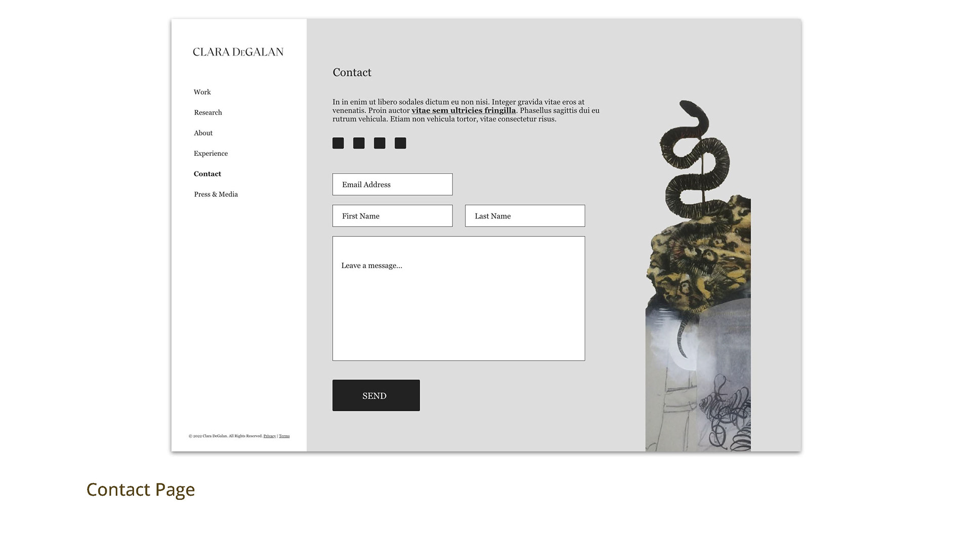
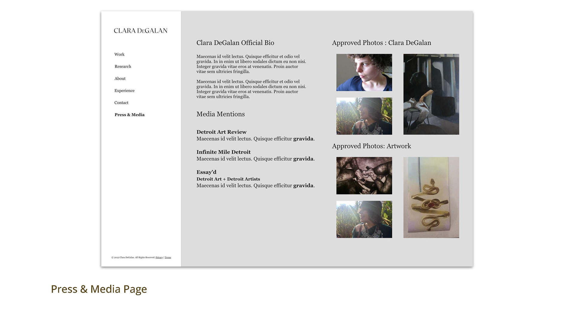
Due to the nature of the work being showcased and the timeline, we opted to move from a low fidelity to a more high fidelity wireframe and comp to share how the visuals of the artwork looks in the space giving a solid start for design decisions.
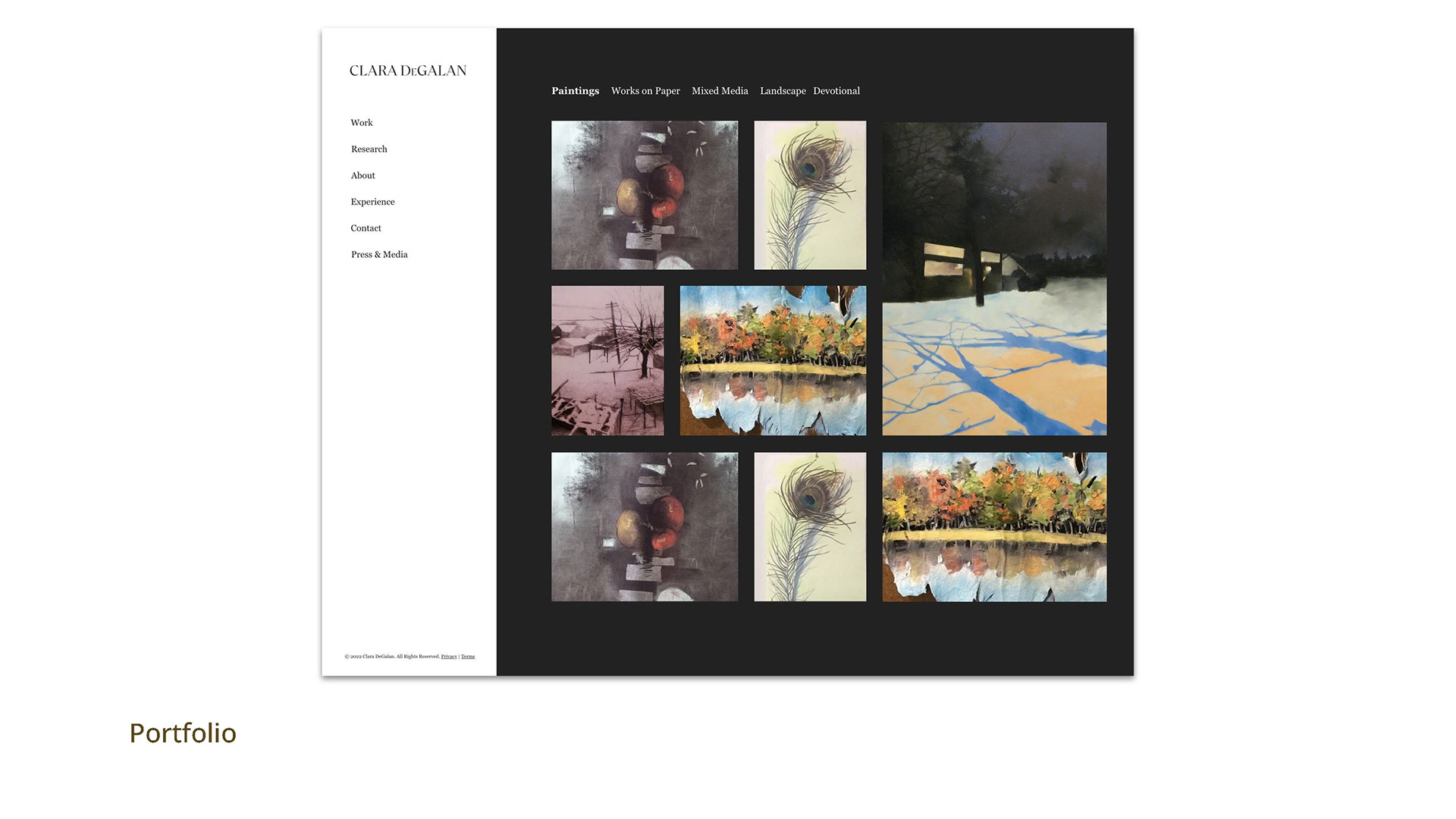
The art work is displayed in multiple ways to differentiate pages from one another and help visitors find their way around the site. Simple grids highlight categories of work. Tiled mosaic features facilitate the portfolio category pages. Visitors are moved from the light exterior to the dark interior of Clara's portfolio.
